|
GRAPH Window
The GRAPH window, located on the right side of the browser window, displays a standard (x–y scatter) plot of the selected properties. Any available property can be plotted against any other.
At the top of the GRAPH window there is a menu bar that contains four drop-down menus and three buttons. The actions of each menu and button are described.
X Menu
The X menu allows you to choose a property to plot on the x–axis. Only one item at a time can be chosen for the x–axis. Every numerical property included in the Periodic Table Live! database is listed in this menu within one of the three sub–menus (ATOMIC PROPERTIES, PHYSICAL PROPERTIES, and OTHER). The item that is currently selected is marked on the menu with a check mark and an arrow pointing to the letter X, indicating that this item is being used on the x–axis. When the applet starts or when the graph is cleared, the selected property defaults to Atomic Number, as shown in Figure 4.1.
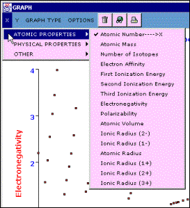
Figure 4.1 – The GRAPH window’s X menu is shown with its default value, Atomic Number, selected.
Y Menu
The Y menu contains the same items as the X menu, plus one extra item, MULTIPLE FIELDS. Only one property to be plotted on the y–axis can be selected from the Y menu. Selecting the MULTIPLE FIELDS item allows you to plot up to three different properties on the y–axis. Items that are currently selected on the Y menu are highlighted with a check mark and an arrow pointing to Y1, Y2, or Y3. An example is shown in Figure 4.2. If an item is selected in the X menu, it is automatically disabled in the Y menu.
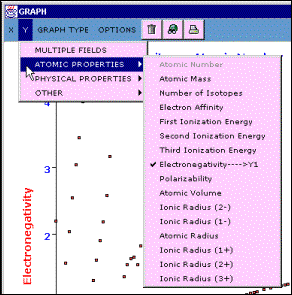
Figure 4.2 – The GRAPH window’s Y menu is shown. Electronegativity has been selected as the first property to be plotted on the y–axis. Atomic Number is shown in gray. It cannot be selected because it is the current selection in the X menu.
Select MULTIPLE FIELDS from the Y menu to open the Multiple Y Fields dialog shown in Figure 4.3. In this dialog, up to three different fields (properties) may be selected simultaneously. The property currently selected for the x–axis is disabled. Click the check box in front of a property’s name to select it. Click the box again to remove the checkmark and deselect that property. Click the OK button to close the Multiple Y Fields dialog and display the selected properties on the graph. To close the dialog without changing the selected properties, click Cancel.
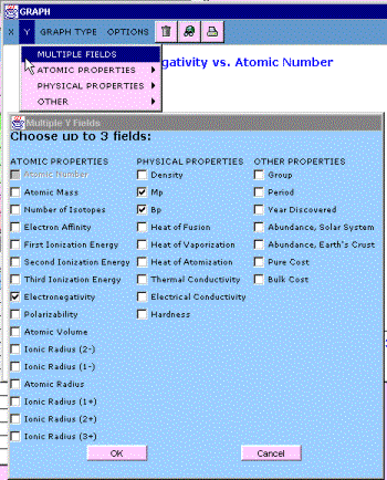
Figure 4.3 – Selecting MULTIPLE FIELDS in the Y menu opens the Multiple Y Fields dialog. Properties or fields are selected by clicking check boxes. Only the property currently selected in the X menu is not available.
When one property is selected, its name appears on the y–axis of the graph. When two or three properties are displayed on the y–axis, the y–axis label reads Y1 and Y2 or Y1, Y2, Y3. The properties represented by Y1, Y2, and Y3 can be determined by three methods:
- Look at the Y menu. On the Y menu, the selected items will be labeled Y1, Y2, or Y3.
- Display the graph’s legend by selecting SHOW LEGEND from the OPTIONS menu. The color–coding of the legend indicates the color of the data points representing each property.
- Look at the graph’s title. The title lists the properties displayed in the graph in the order in which they were selected.
The MULTIPLE FIELDS item is not available when Graph by Period or Graph by Group is selected in the GRAPH TYPE menu.
GRAPH TYPE Menu
The GRAPH TYPE menu, shown in Figure 4.4, allows you to select between three types of graphs.
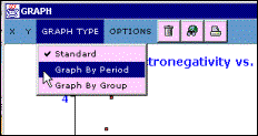
Figure 4.4 – The GRAPH TYPE menu lists three types of graphs that can be displayed in the GRAPH window. Standard is the default option.
The Standard graph is simply a scatter plot of the properties(s) selected for the y–axis versus the property selected for the x–axis. This is only type of graph in which more than one property may be plotted on the y–axis (the MULTIPLE FIELDS is available in the Y menu).
The Graph by Period and Graph by Group options organize the plotted data according to the period or group of the elements. Figure 4.5 shows the result of selecting Graph by Period. A colored line connects the data points for all elements in a given period (or row on the periodic table). Similarly, when Graph by Group is selected, a colored line connects the data points for the elements in a given group (or column on the periodic table). A different color is used for each group or period. To ensure legibility of a graph, only one property may be selected at a time for display on the y–axis in these types of plots. If the Graph by Period or Graph by Group option is selected while multiple properties are displayed on the y–axis, only the property labeled Y1 will remain selected.

Figure 4.5 – The Graph by Period option is shown here for a plot with Electronegativity on the y–axis and Atomic Number on the x–axis for elements in the second, third, and forth periods. An orange line connects data points for elements in the second period, a yellow line connects data points for elements in the third period, and a green line connects data points for elements in the fourth period.
Displaying the graph legend by selecting SHOW LEGEND from the OPTIONS menu may be helpful as it will identify the color used for each period or group.
OPTIONS Menu
The OPTIONS menu, shown in Figure 4.6, contains a number of utility functions that can be used to manipulate data and view plots more efficiently.
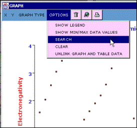
Figure 4.6 – The OPTIONS menu in the GRAPH window provides several options for viewing and manipulating data.
Showing and Hiding Legends
Select SHOW LEGEND from the OPTIONS menu to display the graph’s legend. An example of a legend is shown in Figure 4.6. Displaying the legend can take up a lot of space, and in most cases it is not needed, so it is hidden by default. The legend is most helpful when using the Graph by Period and Graph by Group options in GRAPH TYPES menu and when more than one property is plotted on the y–axis.

Figure 4.7 – This graph has two properties, melting point (Mp) and boiling point (Bp) plotted on the y–axis. The legend at the left side of the graph shows that the melting point data is plotted with red squares and boiling data is plotted with green squares.
After SHOW LEGEND has been selected, it changes to HIDE LEGEND. Select HIDE LEGEND from the OPTIONS menu to remove the legend from the graph.
Setting Minimum and Maximum Data Values
Select SHOW MIN/MAX DATA VALUES from the OPTIONS menu to open the Graph Data Bounds floating toolbar shown in Figure 4.8. It will appear in the upper left corner of the browser window, on top of the PERIODIC TABLE window. You can click its title bar and drag it to another area of the browser window. It may be easier to use the toolbar if you move it onto the white background of the GRAPH window.
This toolbar displays the current minimum and maximum values of the data plotted on the graph. You can change values by clicking the mouse then typing in the white text boxes. Changing the values in this toolbar results in elements being selected or deselected in the PERIODIC TABLE window as well as the contents of both the GRAPH window and the TABLE. You can use Graph Data Bounds toolbar to zoom in or out on sections of the graph and to locate elements that fit specific criteria.
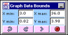
Figure 4.8 – Selecting the SHOW MIN/MAX DATA VALUES menu item opens the Graph Data Bounds toolbar.
The Graph Data Bounds toolbar (see Fig. 4.8) has four buttons. The two left–most buttons are undo ( ) and redo ( ) and redo ( ). The undo button reverts the graph to its previous state. The redo button performs the opposite action. While the toolbar is visible, the last five changes that have been made to the graph are kept in memory. You can move back and fourth among these changes by clicking the undo and redo buttons. Click the graph button ( ). The undo button reverts the graph to its previous state. The redo button performs the opposite action. While the toolbar is visible, the last five changes that have been made to the graph are kept in memory. You can move back and fourth among these changes by clicking the undo and redo buttons. Click the graph button ( ) to apply any changes made to the data in the toolbar, consequently selecting and deselecting elements in the PERIODIC TABLE window and updating the GRAPH and TABLE windows. Pressing Enter or return on your keyboard will perform the same action as clicking the graph button. Click the cancel button ( ) to apply any changes made to the data in the toolbar, consequently selecting and deselecting elements in the PERIODIC TABLE window and updating the GRAPH and TABLE windows. Pressing Enter or return on your keyboard will perform the same action as clicking the graph button. Click the cancel button ( ) to close the toolbar without applying any changes. ) to close the toolbar without applying any changes.
The data values displayed in this toolbar are the minimum and maximum values of the actual data points on the graph, not the minimum and maximum values of the x- and y-axes on the graph. If you type a number in one of the text boxes and then click the graph button, the value displayed in the toolbar will most likely change to a number different than the one you entered. For example, consider a graph with atomic mass on the y–axis and atomic number on the x–axis. If a value of 200 was entered as the maximum x-value (X max: 200) and the graph button clicked, the X max field would end up displaying 112 , because this is the maximum atomic number included in Periodic Table Live!
Entering invalid values in any of the text boxes disables the graph button. If the graph button is clicked while one or more of the text boxes contain invalid data, nothing happens. Examples of invalid data include invalid numbers (such as 123.45.67) and non-numerical characters (such as letters). The only exception is the asterisk character (*). This character may be used as a wildcard, indicating that any value is acceptable.
For example, consider a graph of melting point versus atomic number for all elements in the periodic table. Suppose that you were looking for elements with atomic numbers between 55 and 75 that have melting points higher than 2500 K. If you enter the following into the tooba and click the graph button:
| X min: 55 |
X max: 75 |
| Y min: 2500 |
Y max: * |
Only the elements that fit those criteria, Hf, Ta, W, and Re, would be selected in the PERIODIC TABLE window and only data for these four elements would be plotted in the GRAPH window and listed in the TABLE window.
Searching
Select SEARCH from the OPTIONS menu to open the Search for Elements dialog shown in Figure 4.9. The Search for Elements dialog allows you to search for elements that fit specific criteria. A search is performed by selecting a property and entering the limits of the search.
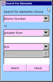
Figure 4.9 – The Search for Elements dialog is opened by selecting SEARCH from the OPTIONS menu. You can search any numeric property to find elements that meet specific criteria.
The top drop-down list contains all of the properties of the elements included in Periodic Table Live!, but only those properties that can be graphed (i.e. properties that are numerical in nature) are enabled. The other drop-down lists and text boxes are used to select the criteria to search for within the selected property. Searches that can be performed using the second drop-down list include greater than ,less than , and equal to the number you type into the first text box. Using the lower drop-down lists you can add and or or followed by another greater than, less than, or equal to, and then type a second value into the lower test box, to create more complex search criteria. Search criteria that are illogical (for example, atomic number is equal to 1 and equal to 2) or contain invalid data (such as letters) result in no items found. Once the search criteria have been entered, click the Search button to perform the search and close the dialog. Click the Cancel button to close the dialog without performing a search.
Performing a search selects all elements in the PERIODIC TABLE window that fit the criteria, and deselects all others, plots data for only those elements in the GRAPH window (the selected property will be plotted on the y–axis, unless the property is already chosen for the x–axis), and lists data for only those elements in the TABLE window. If no elements fit the search criteria, all elements will be deselected, and the GRAPH and TABLE windows will be cleared. If no values are entered in the text boxes in the dialog, performing a search will change the y–axis field in the graph to the search property, but the elements selected will not change.
Clearing the Graph
Select CLEAR from the OPTIONS menu to clear the graph. No elements are selected or deselected when clearing the graph. When the graph is cleared, the property displayed on the x–axis is set to Atomic Number and no properties are selected for the y–axis.
Linking and Unlinking the GRAPH and TABLE Windows
By default, the data displayed in the GRAPH and TABLE windows are linked so that both display the same information (when possible). If a property is selected in the X menu or Y menu, that property will simultaneously be displayed in the Table window. When the GRAPH and TABLE are linked, changing the GRAPH will simultaneously alter the TABLE and vice versa. If you want to change one without changing the other, you must first unlink the GRAPH and TABLE windows.
Select UNLINK GRAPH AND TABLE DATA from the OPTIONS menu to turn linking off. Unlinking the GRAPH and TABLE windows allows more propertie s to be viewed simultaneously.
After selecting UNLINK GRAPH AND TABLE DATA,the menu item changes to LINK GRAPH AND TABLE DATA. Selecting this item turns linking back on.
GRAPH Window Buttons
The GRAPH window contains either two or three buttons in its menu bar that may be used as shortcuts for manipulating the graph. The number of buttons depends on the operating system you are using.
Clicking the clear button ( ) performs the same action as selecting CLEAR from the GRAPH window OPTIONS menu. ) performs the same action as selecting CLEAR from the GRAPH window OPTIONS menu.
Clicking the search button ( ) performs the same action as selecting SEARCH from the GRAPH window OPTIONS menu. ) performs the same action as selecting SEARCH from the GRAPH window OPTIONS menu.
Clicking the print button ( ) sends the current graph to a printer. ) sends the current graph to a printer.
Other Features
The GRAPH window has two additional features designed to assist in viewing and analyzing data displayed in a graph.
The first feature is a pop-up data label that appears whenever the mouse is pointing to a data point in the graph. The pop–up data label contains the element symbol, properties plotted, and xand yvalues for that data point. An example of this pop-up data label is illustrated in Figure 4.10. If the current graph type is Graph by Period or Graph by Group, the period or group of the element represented by the data point will also be included in the pop-up data label.

Figure 4.10 – This graph of Electronegativity on the y–axis and Atomic Number on the x–axis includes a pop-up data label that allows you to easily identify the data point. It this case the point is for the element oxygen.
If a graph contains a large number of data points, it may be difficult to locate the data point that represents a specific element of interest. To alleviate this problem, click any column for an element in the TABLE window to highlight data points for that element on the graph.
Selecting an element in the TABLE window highlights all of the data points for that element in the GRAPH window. For example, in Figure 4.11, there are two data points for boronone for its melting point (Mp) and one for its boiling point (Bp). When any item the row containing boron is selected in the TABLE window, both data points are highlighted in the GRAPH window.
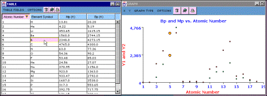
Figure 4.11 – Clicking an item for an element in the TABLE window causes the data points for that element to be highlighted in the GRAPH window. In this example, the graph contains two data points for the element boron.
| 
