
When the topic of Photoelectron Spectroscopy (PES) was added to the AP Chemistry curriculum during the 2013 redesign, I was apprehensive.
I did not study PES in college so it was out of my comfort zone. I have spent the last few years gathering resources to help me teach PES. This year I stumbled on a new way to teach PES and I fell in love! I want to share this simple method so that other teachers might fall in love with PES - or at least tolerate it more!
In previous years, my students utilized the Arizona State PES flash simulation1 and Thomas D Silak’s Excel spreadsheet2 to compare PES graphs, two at a time, to find patterns. This year I only had access to Chromebooks. These Chromebooks could not access the website or the Excel spreadsheet. Frustrated with the lack of compatibility, I decided to be old-fashioned and print out the PES graphs from Silak’s Excel spreadsheet* for students. As a teacher that loves using technology to teach, printing the graphs felt wrong. But this old-school change - printing the PES graphs on paper - turned out to be a game changer in my teaching of the topic.
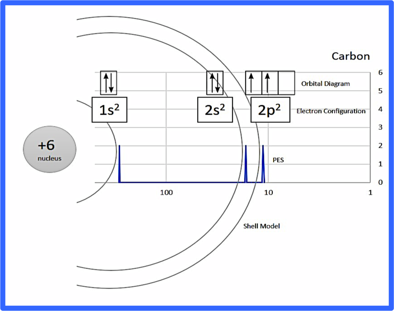
Figure 1: Example annotation for CARBON (you can find a PDF in Supporting Information)
After discussing the basics of PES with my students, I handed them paper copies of the PES graphs for the first 20 elements (see Supporting Information). I had students cut out and annotate the PES graph peaks with electron configurations, orbital diagrams, and shells (see figure 1 for an example). I picked these three methods of representation to model the atom because I wanted students to have enough information to make claims about why the PES peaks shift right, left, or increase in size.

Figure 2: PES graphs in order by atomic number
First, I had students line up the graphs by atomic number (see figure 2). I asked, “What do you notice about the peaks from one element to another?” As I hoped, they noticed that the peaks sometimes got taller and that the subshell peaks (ie. 1s) shifted to the left from one element to another. I asked them, “Why?” I instructed them to discuss with their table partners and use their annotations to help develop evidence and reasoning to back up their claims. I was tickled pink when they reported back to the class. Without my help, they were able to link the height of the PES peak with the number of electrons in the subshell using the electron configurations and y-axis. They were also able to attribute the shifting of the peaks left to the increasing nuclear charge using the shell model. One student also mentioned that there is a smaller gap between the 2s and 2p compared to the 1s and 2s. This was not a question that I expected, but it led to a great discussion about how the model of the atom has been refined from energy levels (ie. 1, 2, 3, etc.) to subshells (ie. 1s, 2s, 2p, etc.). This question also opened the door to explaining why the 2p valence electrons are removed before the 2s or 1s electrons when the atoms become ions.

Figure 3: PES graphs as periodic table
Next I had students arrange their PES graphs like the periodic table (see figure 3). I told students to look at the 2p peak for NITROGEN and OXYGEN and the 3p peak for PHOSPHORUS and OXYGEN. I asked them, “What do you notice?” Students noticed that the 2p peak in OXYGEN and the 3p peak in SULFUR was shifted right. Similar to before, students consulted with their table partners and backed up their claim using evidence and reasoning from their annotated graphs. This proved to be more difficult for students. They quickly noticed that the orbital diagram in both OXYGEN and SULFUR had one set of electrons paired, but didn’t know how to use that to explain why the trend occurred. With another guiding question, “What happens when two electrons get really close together?”, a few students were able to share with the class that when electrons are close together, they repel. These electron-electron repulsions cause the 2p and 3p electrons to be more easily removed than expected, resulting in a lower energy peak or a peak that is shifted to the right.
Finally, I handed them a PES graph of Scandium (a transition metal with a 3d electron). I told them to annotate the graph with its electron configuration. While most blindly completed the task, a few caught that the 4s and 3d peaks were reversed. Using a document camera, I showed the class the two different PES graph answers groups came up with (4s23d1 vs. 3d14s2). I had students discuss the two different answers and use the PES graph data to prove which answer was correct. The class used the height of the peaks to decide that 3d14s2 was correct. I asked them to use their PES graph to justify the electron configuration for the Sc2+ ion. Students were quick to pick up on how the 4s electrons would be removed before the 3d due to lower binding energy.
I followed the activity up with a formative assessment to check for understanding. The questions were modeled after the released 2018 AP Chemistry Free Response questions 3a and 7a as well as a few secure multiple-choice questions from 2018 and 2017. My students scored better than previous classes on comparable PES formative assessments. I was so impressed with the results that I am thinking of using PES in my Honors Chemistry class to help with their understanding of periodic trends and ionization energy. I am hopeful that these PES graphs might provide a clearer picture of periodic trends for my younger students.
You might be thinking - how does analyzing the PES graphs on paper make it better? I took some time to reflect on why this year’s PES lesson produced better formative assessment results compared to previous years. My questioning strategies were similar between years so the big difference was using paper PES graphs instead of viewing them on the computer. After reflecting, I believe it was the ability to annotate and see three or more PES graphs at once that gave the paper version the edge. The annotations really helped my students understand the “why” behind the trends. It was very visual. Since all the graphs were available at one time on separate pieces of paper, students could see more graphs at once and could organize them in different ways (in a line by atomic number, or by periodic table arrangement). Students were more confident in finding patterns when they saw it over three or more graphs. I also found that the cooperative group discussions were richer when students viewed graphs on paper compared to computer screens. This could be because students were standing to see the paper graphs and they all helped rearrange the graphs while discussing. When using computers, most students had their eyes glued to the computer screen while talking with others. Since teaching the PES lesson this year, I discovered that Michael Bolt converted the PES Excel file into a Google sheet and graciously shared to the AP Chemistry Teacher Community Discussion Board.3 Next year, I will have my students use his PES Google sheet on Chromebooks for part of the activity, but I will still print out and have students annotate PES graphs like we did this year.
My newfound love affair with PES is the result of many little things teachers have taken the time to share publicly. I feel very fortunate that we have such a welcoming and supportive chemistry teacher community! I hope that you can take something from my PES lesson, tweak it, and share it out again! Thank you to all the wonderful chemistry teachers that are so willing to share their ideas on ChemEd X, social media, and discussion boards. #sharingiscaring #bettertogether
*Special THANKS to Thomas Silak for allowing me to share images of the PES graphs from his document.2 ChemEd X readers can find them in the Supporting Information.2
CITATIONS/ACKNOWLEDGEMENTS:
1 Arizona State PES flash simulation (accessed 2/25/19)
2 Thomas D Silak’s Excel PES spreadsheet - accessible on the AP Teacher Community Discussion Board under Resources (accessed 2/25/19)
3 Michael Bolt’s Google sheet PES Spreadsheet - accessible on the AP Teacher Community Discussion Board under Resources (accessed 2/25/19)
*Editor's Note: Jamie Beninga wrote an excellent article about PES for the Journal of Chemical Education - AP Chemistry Special Issue. The supporting information includes a Word document containing sample assessment items and two Excel spreadsheets: one containing the reference peaks for the first 80 elements (“PES peaks compiled”), and one that can generate simulated photoelectron spectra with both a linear and logarithmic x-axis for the first 21 elements (“PES Graph Generator v3”) individually or in pairs for comparison.
James Benigna, Photoelectron Spectroscopy in Advanced Placement Chemistry, Journal of Chemical Education 2014 91 (9), 1299-1305.
NGSS
Students that demonstrate understanding can develop models to illustrate the changes in the composition of the nucleus of the atom and the energy released during the processes of fission, fusion, and radioactive decay.
*More information about all DCI for HS-PS1 can be found at https://www.nextgenscience.org/dci-arrangement/hs-ps1-matter-and-its-interactions and further resources at https://www.nextgenscience.org.
Students that demonstrate understanding can develop models to illustrate the changes in the composition of the nucleus of the atom and the energy released during the processes of fission, fusion, and radioactive decay.
Assessment does not include quantitative calculation of energy released. Assessment is limited to alpha, beta, and gamma radioactive decays.
Emphasis is on simple qualitative models, such as pictures or diagrams, and on the scale of energy released in nuclear processes relative to other kinds of transformations.